You have 50 milliseconds to prove your worth.
To make or break your first impression.
To grab your customer’s attention.
To open the doors for a meaningful relationship.
Yes, I am talking about your website.
But how would you do that? That, I will discuss later in this article.
But for now, I want you to take this responsibility and OWN IT!
Repeat this out loud:
IT’S MY JOB to grab my site visitors’ attention. If I am failing to do so, then I am the one to blame – not my visitors’ lack of interest.
Good! Keep chanting this mantra until you master it.
Assuming that you have owed up to the task, I will now move forward to further our discussion about:
- How can you grab your audience’s attention?
- How do you hone in on your visitor’s short attention span and capitalize on it?
- What shouldn’t you do if you want to make a good first impression?
- How people read online?
- And how people make decisions?
In my previous blog, I discussed how to boost your conversions by understanding human behavior. This week, I will talk about attention basics and the decision-making process.
So, let’s dive in.
How Can You Form A Reliable First Impression?
Do you know first impressions are formed within a matter of 0.05 seconds?
If you fail, it is game-over. Because even facts can’t change the first impressions.
First impressions are formed when a visitor lands on your site for the first time. By having a good first impression, you build trust. Why is this important?
Because building trust is an essential step towards productive relationships both at a personal and professional level. To achieve this goal, you need to prove yourself as a trustworthy and reliable source of information.
There are 4 key elements that can help you build a good first impression:
The Look & Feel Of Your Site aka The Visual Identity
Research has suggested that the visual design of your websites plays a crucial role in determining your first impression. If your site has a poor User Interface (UI), it generates mistrust and rejection.
According to Google research, some site visitors make opinions about a website within 17 milliseconds. It’s that important!
There are many ways you can make a good first impression and garner trust for future relationships. For instance:
- Have an excellent visual appeal and a proper navigation menu.
- The site should be easy to understand and have low visual complexity.
- Simple and familiar to other sites in your niche (high prototypicality).
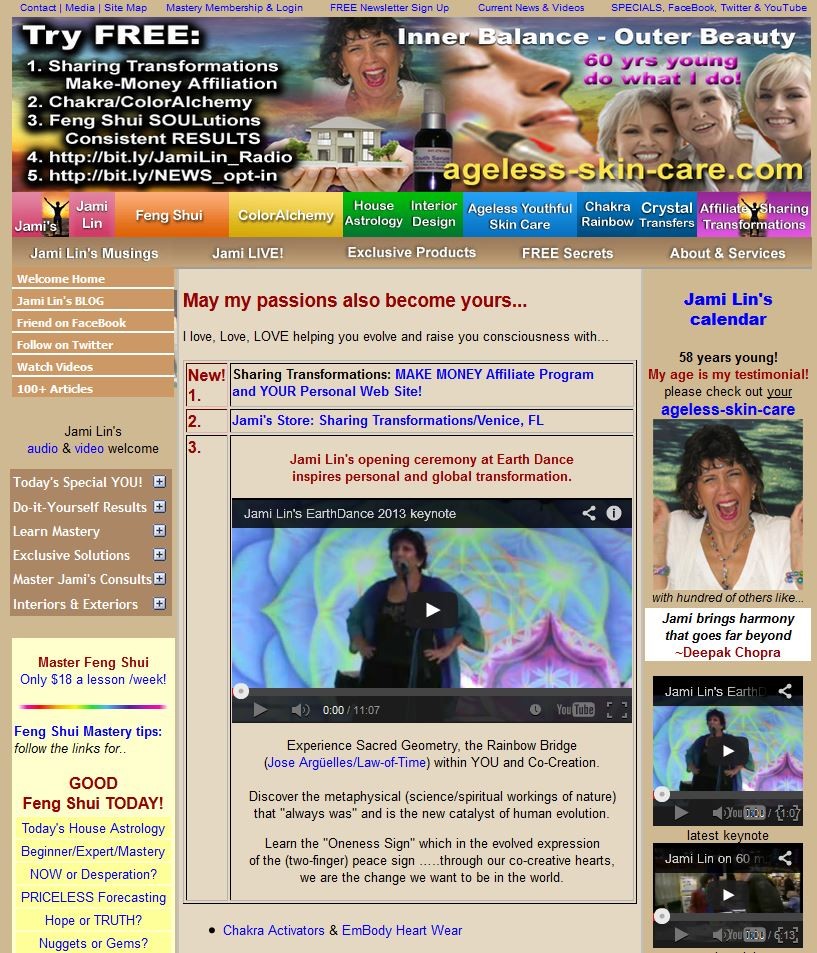
Look at the following website images. Which one do you think is more visually appealing and trustworthy, site A or site B?
Site A:
Site B:
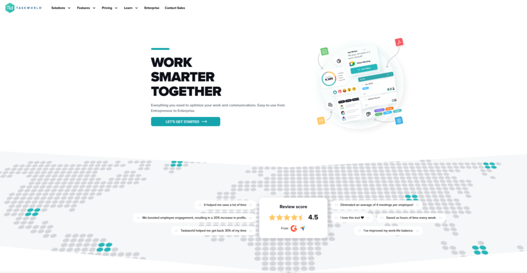
I bet it’s not Site A.
Your Value Proposition
If you have a clear value proposition above the fold on a homepage, it will impact many first impressions. You can do this by:
- Stating your end benefit in 1 short sentence in an attention-grabbing Headline.
- 2 to 3 sentences stating what you do or offer, why, and for whom it’s for – a further explanation in the Subheading.
- Listing the key benefits in 3 to 4 bullet points.
- Showing the product or any other hero image that supports your key message for the sake of visual appeal.
Attributes Of A Strong Key Value Proposition
There are some attributes that you should keep in mind while defining your key value proposition:
- It should be clear.
- It communicates the results a customer will get.
- It shows how it’s unique and different from competitors.
- It must AVOID Cliché like best, never-seen-before, or jargons like value-added.
- It can be read and understood within 5 secs.
Compelling Graphics
Graphics is another aspect of your site’s visual identity. However, there are a few points to consider if you have images on your website.
- Your images must compliment your products. For instance, if your target audience is women, pictures of men or kids will be confusing.
- You should use realistic-looking images. Use pictures of people and smiling faces on your site. If the person is next to an important part of your site, or copy, he/she should be looking in that direction. This technique is called a visual cue. It directs the user’s eyes towards the copy or CTA.
- Don’t overdo it. Keep your site imagery to essentials only.
- Always use high-quality professional pictures. Avoid cheesy stock images. Poor quality images depict mistrust.

Efficient use of visual cues in the above hero image. Two guys are facing forward, looking at their laptops. Just above their laptops is the CTA to sign up for the product.
The way they’re positioned makes your eyes gravitate toward the center of the page to the CTA. That’s how a visual cue is powerful.
Moreover, data from eye-tracking heatmaps have shown that people pay more attention to the form if a visual cue is used, such as an arrow or a human that’s looking towards the form. So, use a visual cue leading towards your form or part where you want your user to pay attention to.
People like to buy from people like themselves. If you want to sell to people, you need to use their language. Use simple and clear language. Avoid using un-realistic images and low-quality stock photos.
Avoid Cognitive Load
Cognitive load is the amount of mental energy that’s required to process something. It states that we have a minimal capacity to process new information.
Look at the image below:

Too much information to process, right? That’s cognitive load.
Having too much cognitive load, or unnecessary information on your site can cause your users to divert their attention and leave your website.
You should minimize it to grab and hold your user’s attention enough to allow them to browse your website further and hopefully make a purchase. Make the whole process easier for them instead of getting them overwhelmed and abandoning the cart.
Many factors can cause cognitive load:
- Distracting and irrelevant imagery on your site.
- Carousals that change too quickly.
- Unclear copywriting.
- Confusing and conflicting value proposition.
- Poor user interface and navigation.
- Lots of banner ads on a website – they are clutter. SERIOUSLY!
We can minimize the cognitive load in different ways:
- Break down the large and confusing information into digestible chunks of information. Show overwhelming information into simple, clear, and small steps. The user will take one step at a time towards the goal; hence, learning will become much easier.
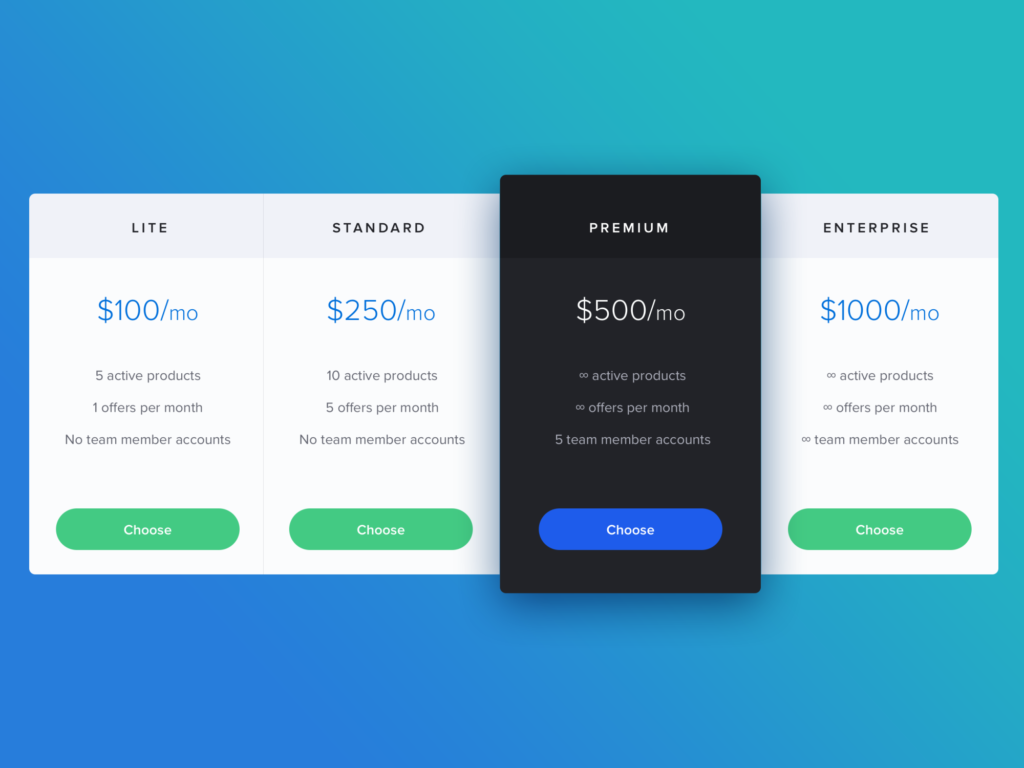
- Presenting information in an effective illustrative form. Some information is better understood when presented in a diagram. Take different pricing plans on your site as an example. Otherwise, it will be confusing to understand in the written form.
Online Reading Patterns
People read in patterns. The 3 most common patterns are:
1. F-pattern
In F-Pattern, when users land on your site, they read from the left side and move in a horizontal direction (usually across the upper body of content). That makes the F’s top bar.
Next, users move down the page a bit and read across in a second horizontal movement (typically a shorter area than the prior eye movement). That makes the F’s lower bar.
Finally, if they like what they read, they will explore the left-side content in a vertical direction making the F’s stem.
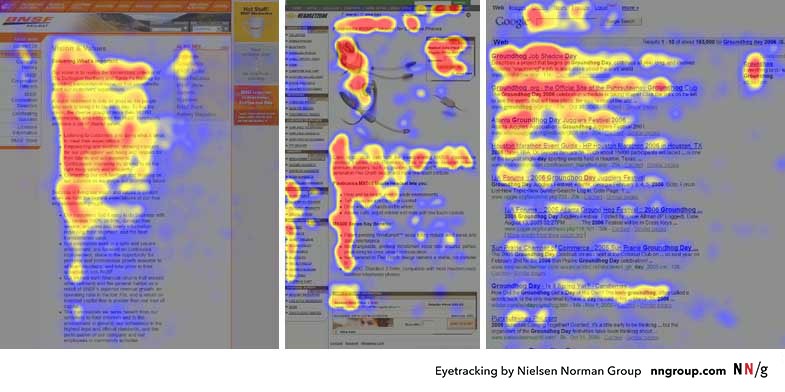
The above image is the heatmaps from user eye-tracking studies of three websites. The areas where users looked the most are colored red; the yellow areas indicate fewer views, followed by the least-viewed blue areas. Grey areas didn’t attract any fixations.
How to Implement F-Pattern?
In F-Pattern, more attention is placed on the left side of the screen (in the English speaking/reading countries). Therefore:
- Place the most important points in the first two lines and paragraphs on the page.
- Each line should start with a catchy word.
However, F-Pattern designs don’t always have to follow a traditional F-Shape.
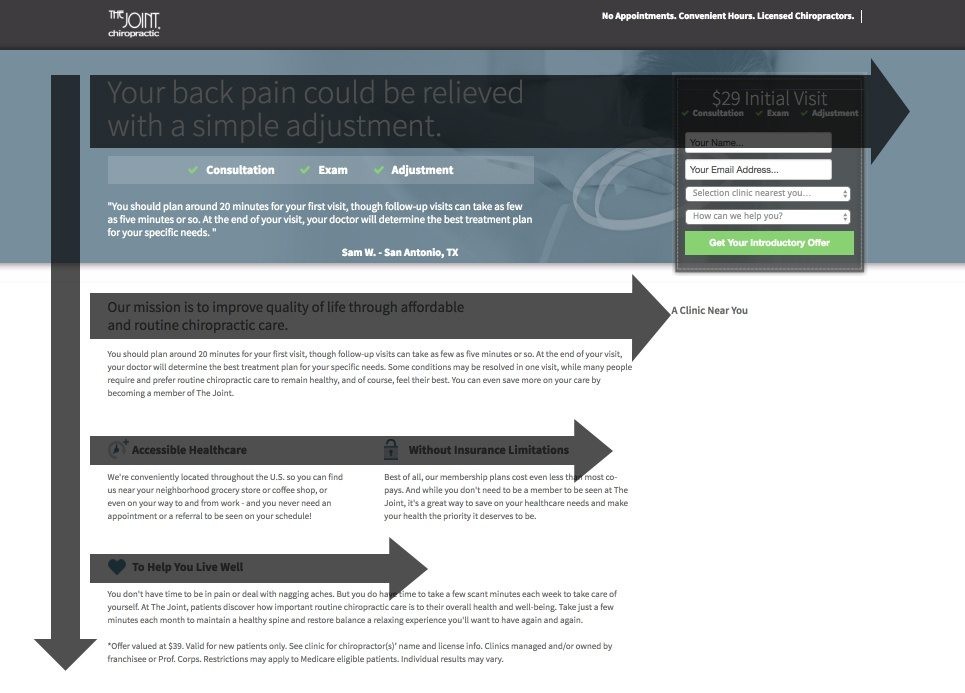
in the above image, see how “The Joint Chiropractic” landing page has quite a few horizontal stems:
- The headline begins the F-Pattern (and continues to the right towards the form).
- Second, the mission statement (in larger and bolder font than the rest of the copy) falls along the next stem.
- Finally, the icons and bolded benefits of The Joint Chiropractic make up the final stems of the pattern.
2. Layer-Cake Pattern
It is a more committed pattern. This pattern occurs when the eyes scan headings and subheadings and skip the normal text below.
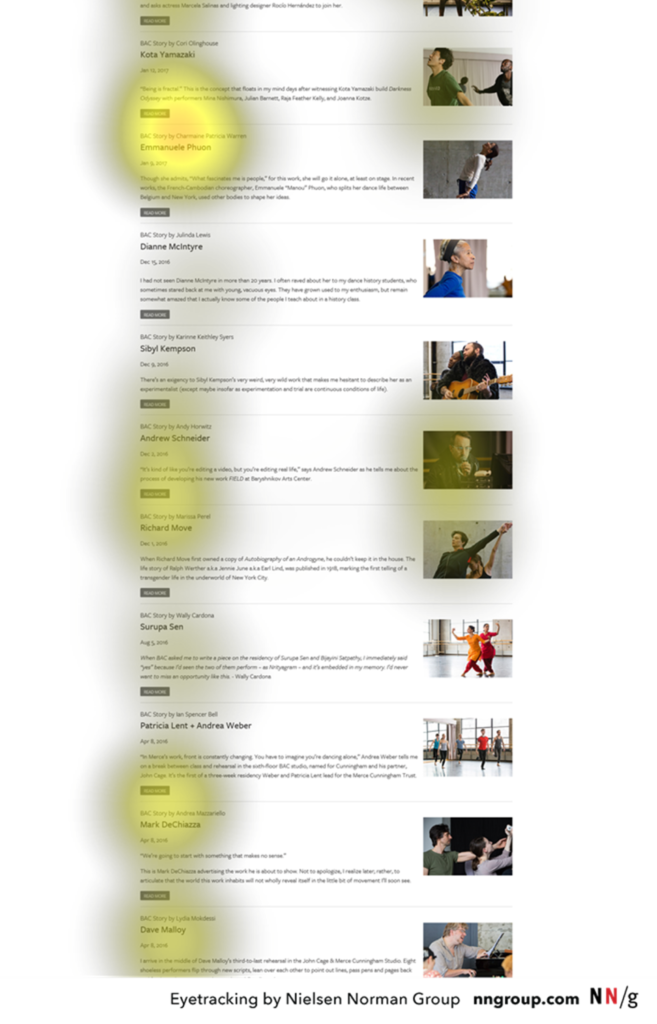
How to Implement Layer-Cake Pattern?
In the layer-cake pattern, more attention is paid to headings. So:
- Divide your text into useful headings and subheadings.
- Ensure they look more important and visible than the normal text so users can differentiate them quickly.
- Cut the fluff and unnecessary content.
- Use different typeface and font size for headings.
If this pattern serves the user’s purpose, they moves to the next pattern – the spotted pattern.
3. Spotted Pattern
This pattern consists of skipping big chunks of text and scanning for some specific information to get the main idea, such as a link, numbers, a particular word, or a set of words with a distinctive shape (such as an address or signature).
How to Implement Spotted Pattern?
- Bold important words and phrases.
- Format your links in different colors and ensure that links include information-bearing words (instead of generic “go,” “click here” or “more”).
- Use bullets and numbers to call out items in a list or process.
- Visually group small amounts of related content, such as surrounding them with a border or using a different background.
- Use of CAPITAL LETTERS for important text.
- Put important words in “quotation marks” or different colors. You can also underline it.
- Use numerals instead of number spellings, such as 7 instead of seven.
If you succeed in grabbing your visitor’s attention, they will likely be able to make a decision. This moves us forward to the process of decision making.
Decision Making Process
Do you know we make about 35,000 decisions per day? And 1 million decisions in a month. That’s insane! But that’s true!
Many factors influence our decision-making process. If we, as a website owner, identify and understand them, it can be a powerful tool.

What Is A Decision?
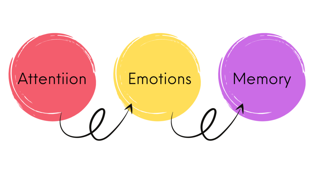
A decision is a determination arrived at after consideration. We, humans, make decisions but rationalize them later. There are 3 things needed for every single decision we make:
- Attention. It is the state of applying your mind to something. The first step towards the decision-making process is to pay attention to something.
- Emotion. They mostly occur at an unconscious level. After paying attention, you need to have an emotional response to it to move forward in the decision-making process.
- Memory. Then, this information needs to be uploaded into our memory for a final decision to occur.
When all of the three are perfectly aligned with each other, you end up making a decision.
4 Factors That Affect Our Decisions
There are 4 chief mental processes that influence our decisions:
1. Cognitive Biases
As I discussed earlier in this blog, cognitive biases are systematic errors in our thoughts. They affect our decisions and judgments. Different kinds of cognitive biases occur at different levels.
For instance:
- Belief biases are when we over depend on past knowledge while making a decision.
- Omission biases are when we tend to ignore information that’s perceived as a risk.
- Confirmation biases are when you observe according to your expectations.
You can have look at the full list of cognitive biases here.
2. Memories
Memories or past experiences can impact future decision making. If your buying experience from an online store is not good, you won’t buy online to avoid repeating past mistakes.
3. Reasoning
People make decisions based on abductive reasoning by using the best information available. This type of reasoning produces daily decision making.
4. Emotions
Decisions are emotional. We make decisions solely based on our emotions, as demonstrated in a study done by Neuroscientist Antonio Damasio.
By keeping all that in mind and measuring attention, emotions, and memory through applied neuroscience methods, you can capitalize on decision-making milestones.
Final Say
Creating powerful first impressions is important if you want to build trust, capture attention, and guide visitors toward meaningful actions. Focus on elements like:
- visual identity,
- compelling value propositions,
- reducing cognitive load,
- understanding decision-making processes
By understanding them you can transform your website into a trust-building and conversion-driving powerhouse. Remember, every second counts—ensure your site not only looks great but also aligns with your audience’s needs and behaviors to leave a lasting impact.



8 Comments
Comments are closed.